Branding is like crafting a company’s unique personality in the eyes of the public—a mix of visuals and stories that vividly showcase where it comes from, what it believes in, and what it aims to achieve. It’s the art of creating a lasting impression, using logos, colors, and words to tell a company’s genuine story and connect with people on a meaningful level.
Ardiendo Learning LLC.
Ardiendo’s branding is a carefully crafted fusion of its core values and mission to ignite a passion for learning in each student. The name itself, meaning to glow, shine, heat up, and make smart, serves as a dynamic metaphor for the transformative journey Ardiendo envisions for its students. The logo, color palette, and messaging are all designed to communicate this fervent desire to kindle a lasting fire of knowledge and enthusiasm within each learner.
The visual elements evoke warmth and vibrancy, symbolizing the educational spark that Ardiendo aims to ignite. The choice of colors reflects the energy and intelligence the brand seeks to cultivate, creating a visual language that resonates with the essence of their mission.


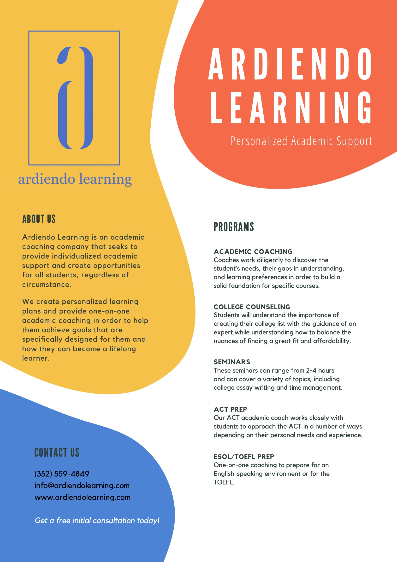
Furthermore, Ardiendo’s mission to inspire lifelong learning through student-mentor relationships is reflected in the branding’s emphasis on connection and growth. The langauge and imagery incorporate symbols of mentorship, fostering a sense of guidance and support integral to their educational philosophy.


East Julia
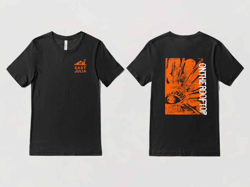
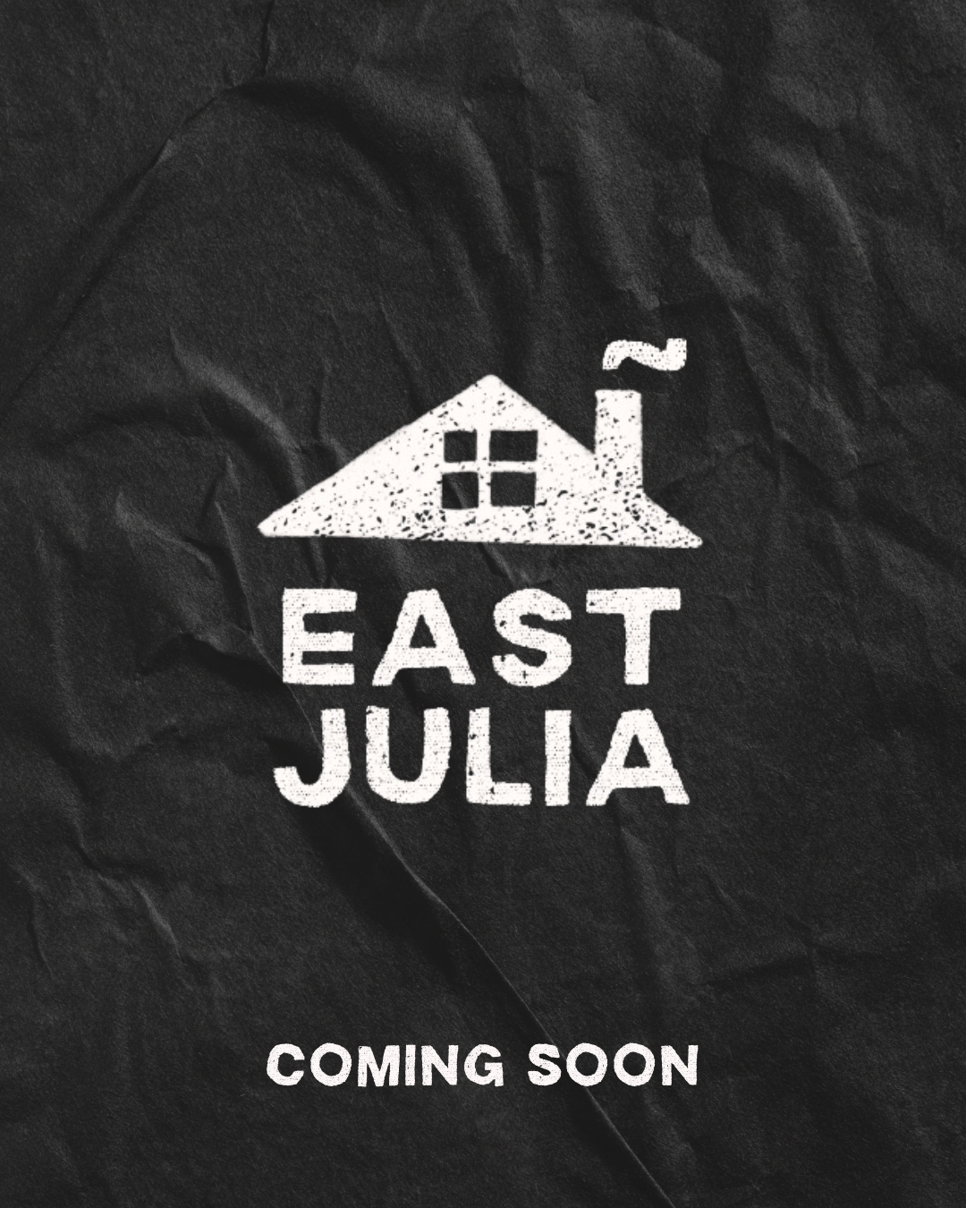
East Julia, an indie rock band formed by a few close friends, introduced a project that started as a fun distraction but evolved into a significant part of my upper-level graphic design coursework.
Over the year, my work was rigorously critiqued and refined, resulting in a cohesive branding strategy that captures the band’s essence. I aimed to infuse a homemade, garage band energy into the branding, reflecting their raw and authentic musical style. The cabin motifs were a deliberate choice, inspired by the band’s origins—playing music on the rooftop of their college cottage. This imagery not only ties back to their roots but also enhances the rustic, down-to-earth feel that complements their indie rock sound.

Berry Center for Integrity in Leadership
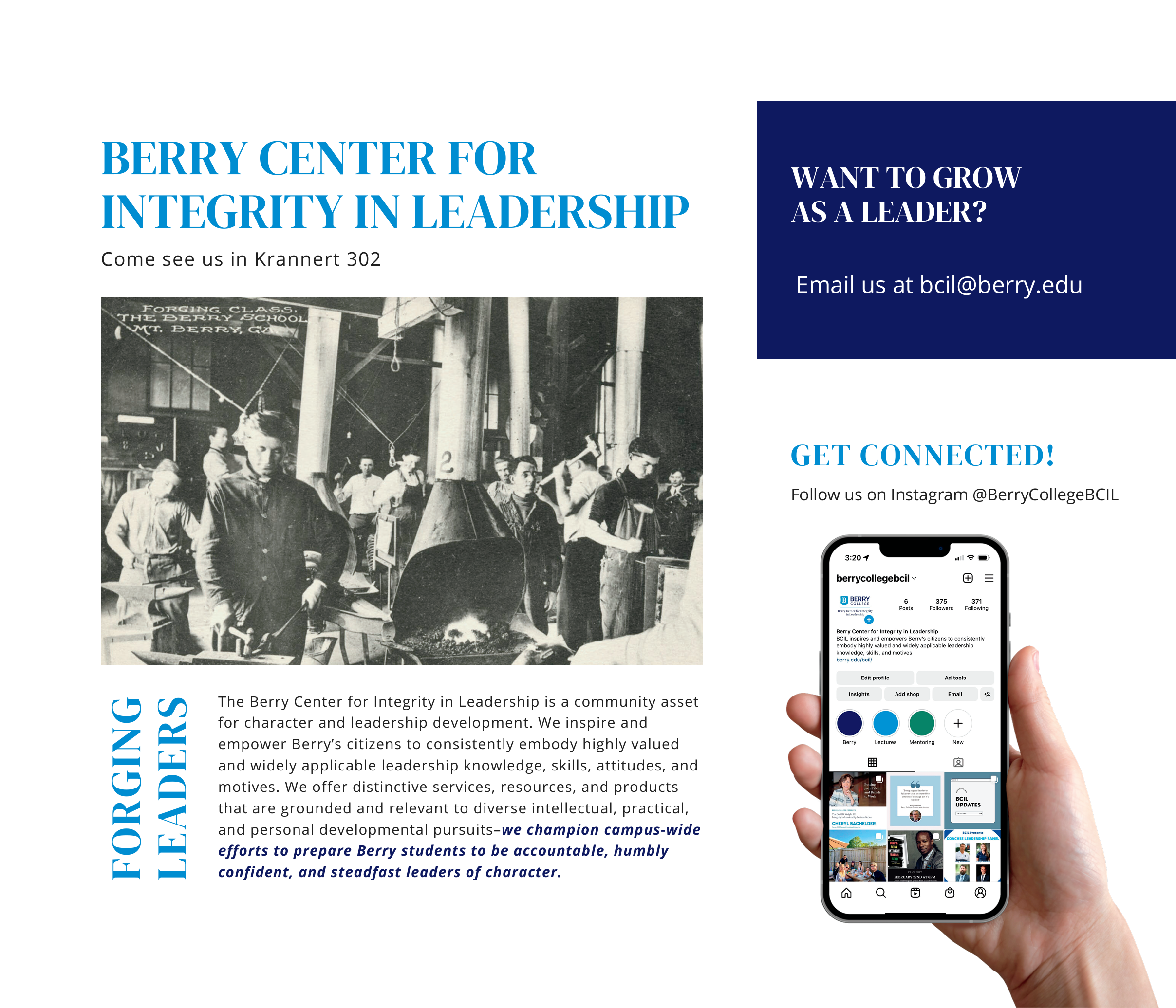
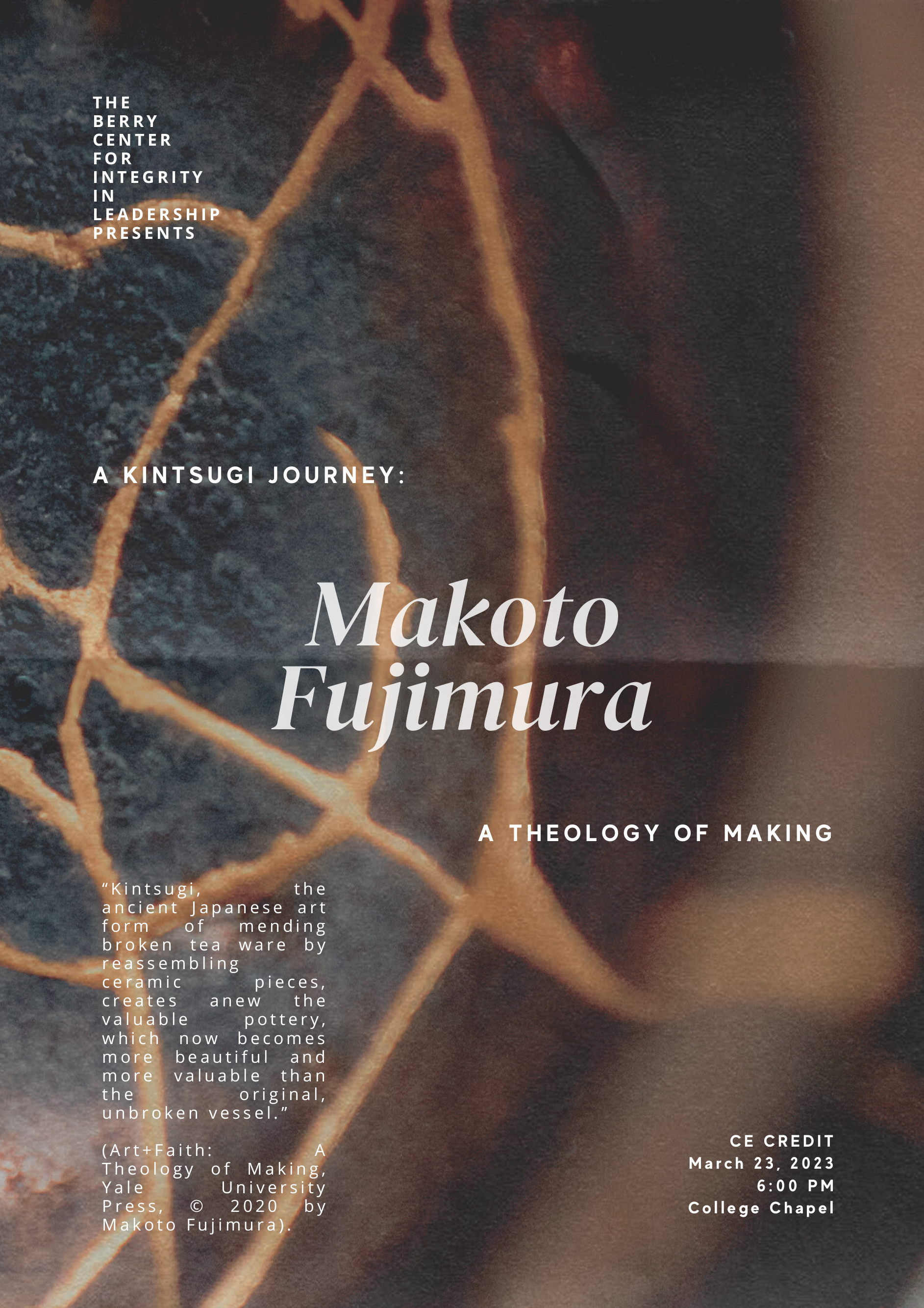
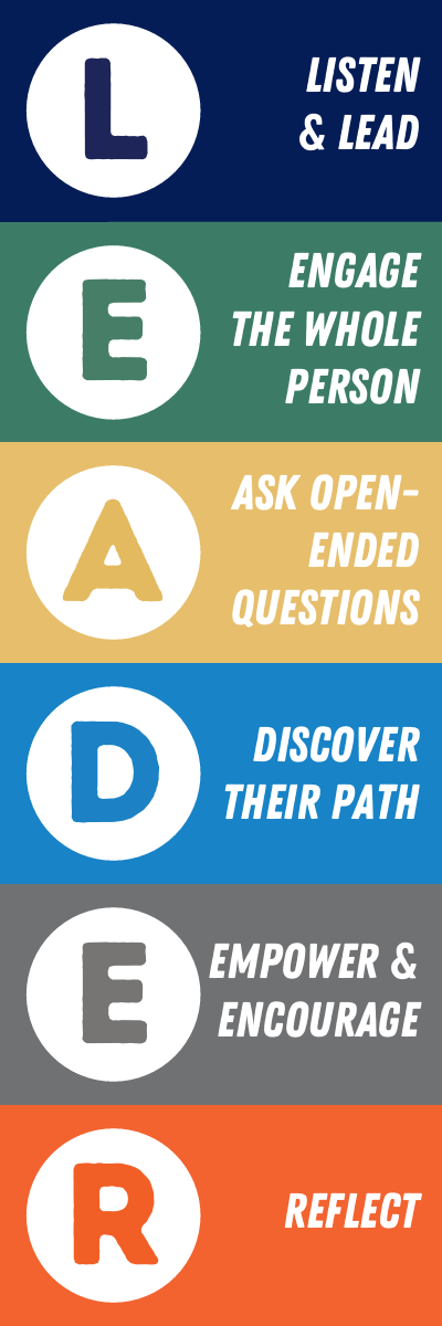
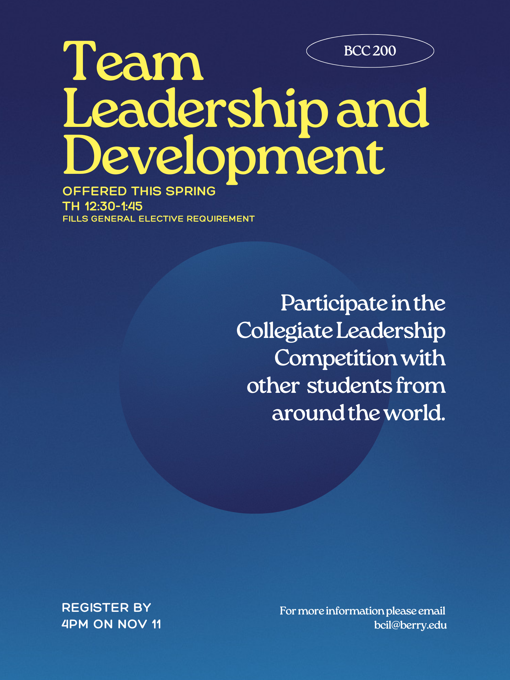
Navigating the crossroads of communication and principled leadership, I’ve led impactful branding initiatives and crafted engaging content, ensuring the Berry Center for Integrity in Leadership resonates within our community.
As the Communication Coordinator at the Berry Center for Integrity in Leadership, I’ve played a pivotal role in translating the center’s values and mission into impactful content across various platforms. Through engaging social media campaigns, visually appealing materials, and informative content, I ensured our messaging resonated with the diverse intellectual, practical, and personal pursuits central to the Center’s mission of fostering principled leadership within our community.
Whether spearheading branding initiatives for the Cecil B. Wright III Integrity in Leadership Lecture Series, student-led Leadership Labs, Carper Mentoring Program, or the Developmental Conversations for faculty and staff, I strategically communicated our commitment to empowering the community with highly valued leadership knowledge, skills, and values.


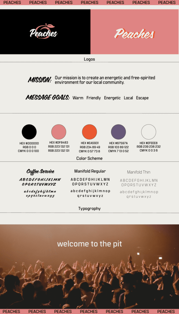
Peaches
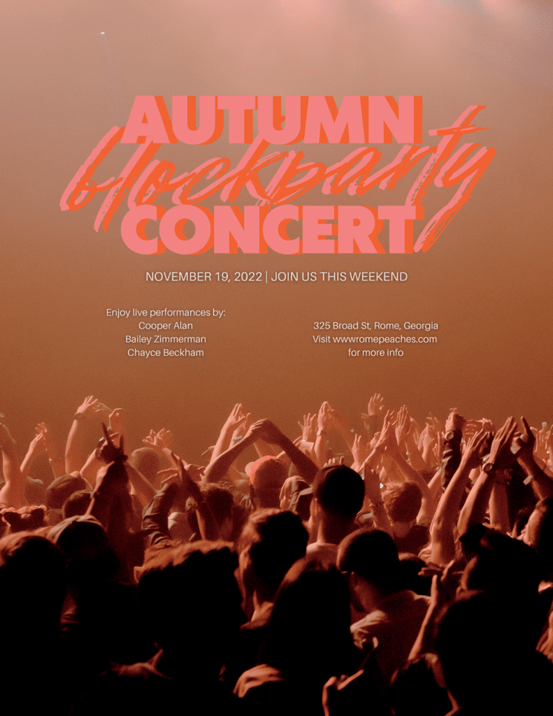
In one of my college courses, I had the exciting opportunity to develop a comprehensive branding package for Peaches, a vibrant bar with a mission to foster an energetic and free-spirited community.
Guided by their vision, I crafted a visual identity that encapsulated the lively essence of Peaches. From a dynamic logo to a playful color palette, every element aimed to communicate the sense of community and exuberance that Peaches aspired to cultivate. The branding package became a creative manifestation of their mission, weaving together design and messaging to not just represent a bar but to encapsulate the spirit of a lively, welcoming space where individuals could come together and revel in the joy of shared experiences.
